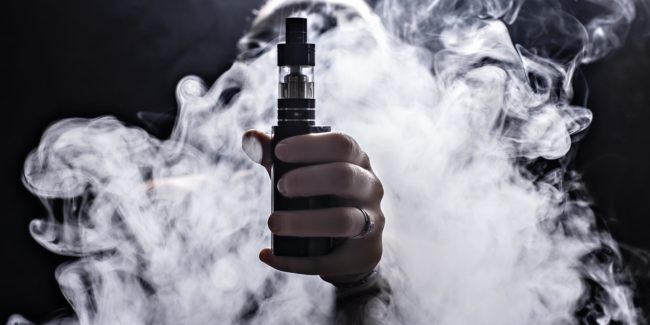
In the last few years, women’s issues have been given (some of) the attention they deserve. Issues like the pink tax, inequality in the workplace, and the gender income gap have been in the news more often, but to be honest this is just the tip of the iceberg. Another sexist trend that deserves attention is the ill-conceived strategy of marketing toward women with the “shrink it and pink it” method.
Essentially, the idea is that if you make the product smaller and pink, women will be attracted to it. Companies have been using this method to advertise their products toward women for decades, but women have had enough. Our interests in products are based on more than utilizing stereotypical colors, scents, or shapes. Let’s talk about a few ways products can be packaged and aimed toward women without going down this dead end road.
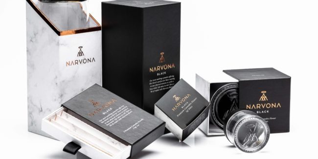
1. Properly use white space for a clean aesthetic
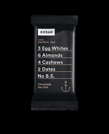
When branding your product, properly utilizing white space allows the true messaging to come through loud and clear. No games or gimmicks, it’s a fast way to tell the consumer what they need to know and allows for the product to shine through. Women value honesty. Women also value simplicity and locating the information they need quickly. RX Bars do a great job of utilizing white space to show the consumer exactly what they need to know while still maintaining a beautiful package.
2. Choose appealing color schemes

Whether you choose to go with nude tones, black & white, soft pastels, bright contrasting colors, or variations of color hues, having a strong color palette is important. Although you may think colors are simply elements of design, color theory explains that colors can evoke visceral reactions due to cultural traditions, sentimental memories, deep inner values, and much more. Brands that get their colors right can evoke intrigue and pull the consumer in. And, shocker, these colors don’t have to be pastel pinks, fuschias, and purples to get the attention of women.
3. Utilize sleek typography
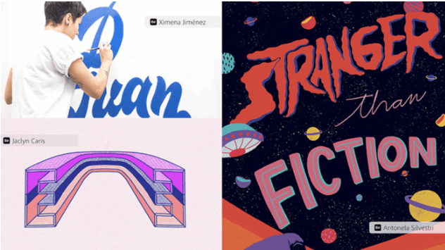
Typography has the potential to be a strong aspect of your design. It can communicate the personality and voice of your brand or product. In particular, hand-lettering has risen in popularity and has been said to have a feminine aesthetic. Typography can communicate the individuality of your brand and help you to stand out against other brands.
3. Vintage inspired designs
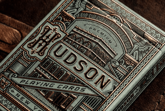
There’s something especially beautiful about adopting the intricate vintage patterns, shapes, and lettering of yesteryear. Vintage designs, florets, and lettering have a way of imparting a premium feel. Vintage designs are typically rooted in a strong layout with sleek hierarchy. It brings a sense of nostalgia and yet can be reimagined for modern-day brands. Many women have an appreciation for the artistic intricacy of vintage art.
5. Bright Gradients
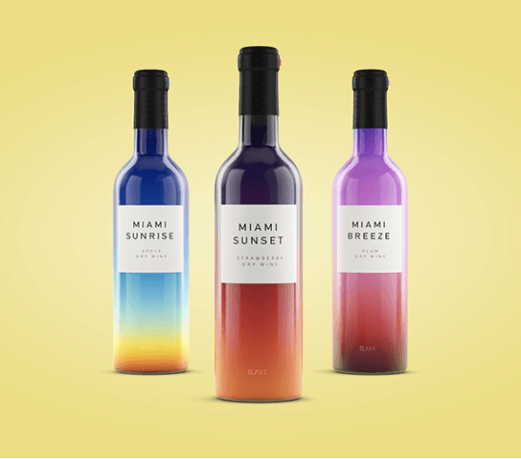
With a vintage feel, but a modern vibe, gradients have made a big comeback. From hair (balayage) to fashion, logos, and packaging, when done right, gradients can leave a lasting impression. Many of the most captivating design inspirations come from nature, and this category is no different. Gradients are naturally occurring in sunsets and sunrises, plants, within the coats of animals, in bodies of water and much more. In a way, it evokes a sense of calm, airiness, familiarity, and depth.
6. Watercolor
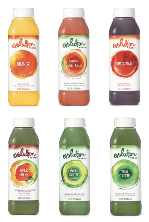
Most people can get behind the beautiful layers, imperfections, and intricacies of watercolor. This type of art has a way of speaking through soft hues, communicating a fluid almost fairytale-like feel. Take the beautiful design of Evolutions Juices for example. The color combinations perfectly communicate different combinations of fruits and vegetables within their beverages through overlayed colors.
7. Environmentally conscious packaging
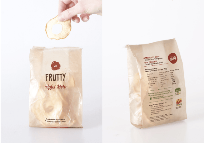
A study by Neilsen suggests that 66 percent of consumers said they would pay more for sustainable brands. Women tend to have a natural inclination to care about the well-being of others, and when it comes to packaging it’s become more and more evident that our choices may impact the planet and the many creatures that inhabit it. By utilizing natural, biodegradable, non-toxic, or recycled materials, brands have the opportunity to tap into the caring nature of most women.
8. Design no-no: the objectification of women

Let us not to forget to mention one trend that really needs to go away for good (in the cannabis industry and everywhere). The objectification and over-sexualization of women to sell products. It’s a demeaning and extremely outdated practice that ultimately needs to end for good. The objectification of women will isolate your brand and push away half of your potential customers.
Although it may seem obvious to most women that pink is not a good marketing strategy, companies need to catch up. With an eye for clean, beautiful, sleek aesthetics, women seem to want some of the very same things as men: products that align with their values, desires, and needs that don’t minimize them through shallow design concepts.