A great way to keep your cannabis brand relevant is by embracing the latest trends. That doesn’t mean you have to change everything about your brand on an annual basis, but what it does mean is that your cannabis company needs to at very least needs to look like it is tuned in to the latest cultural zeitgeist. The best way to accomplish this is by adopting these 2019 graphic design trends.
So what is going on the in the world of graphic design? Here’s a look at the top graphic design trends for 2019:
Top Design Trends of 2019
1. Open Compositions
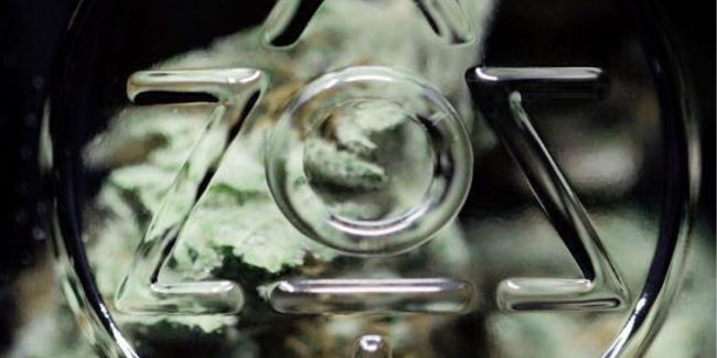
One of the most popular graphic design trends of 2019 is open composition. To give you a better idea of what open composition is, let us take a moment to discuss its opposite: close composition. Closed composition is a static image where the subject is neatly framed to be the focus on the image. All of the design elements are meant to draw your attention to the subject, which is usually close to or in the center of the picture.
Open composition does the opposite. Instead of having a single subject grabbing your attention, an open composition is a dynamic image meant to draw your focus to various elements in the picture. Open compositions also have element that runs off the edge the image’s boundary, which creates a sense that something is happening just outside your field of view. Here’s an example of an open composition:
RELATED: 42 INSANELY CREATIVE & STUNNING CANNABIS PACKAGING DESIGNS
2. Anti-gravity
Adhering to the immutable laws of physics is so 2018. In 2019, everyone is talking about anti-gravity. What I mean by that is the incorporation of flying or floating elements into graphic design. Often used in conjunction with open composition, anti-gravity elements give off a sense of exploration and liberation. Using anti-gravity elements can help enhance otherwise ordinary or boring elements, especially when it comes to product packaging!
By all accounts, this is just an average container of skin cream. However, by making the containers slightly askew and off the ground, you get the feeling that this is something new, something different. The reason why is that we often associate symmetry with orthodoxy, and we associate flying/floating with freedom. By “defying” what is orthodox and including elements that we associate with freedom, our minds subconsciously tell us that this is something new and unique.
3. Vivid colors
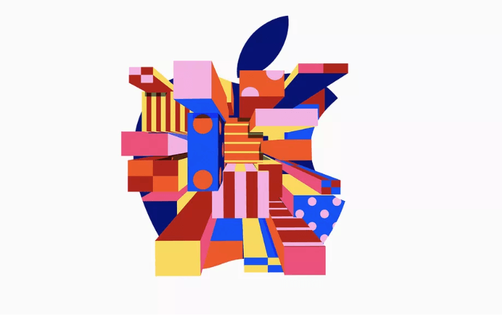
In a world that can sometimes be bleak and dreary, it is occasionally useful to remind the world that the future is still bright. One way you can do that in your cannabis design for 2019 is by incorporating vivid colors. Think bright blues, reds, yellows, and maybe some green thrown in there for good measure. Aside from the fact that vivid colors are one of the hottest graphic design trends of the year, vivid colors are great because they catch your attention. In a market where everyone is fighting for attention, incorporate eye-popping design elements is a great way to make a memorable first impression.
An excellent example using vivid color can be found in the ever-trendy Apple. Always ahead of the curve, Apple redesigned its logo for an event late last year that radically re-envisioned its logo through a lens of vivid colors and mind-bending styles.
If you really want to incorporate all of the latest and greatest graphic design trends into your cannabis design, then you might also want to consider incorporating Coral into your vivid color scheme. Pantone, one of the world’s leaders in color inspiration (and best known of its Pantone Matching System), named Coral its color of the year. When Pantone named Violet its color of the year for 2018, it became one of the most popular graphic design trends of the year; and the same thing will most likely happen with Coral as well.
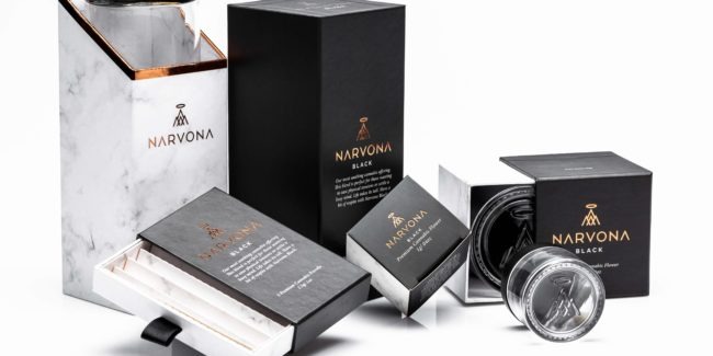
4. Metallic effect: Golden, silver, iridescent
Another popular 2019 graphic design trend is the implementation of metallic effects. Giving certain elements of your cannabis design a metallic element can create a variety of effects, especially if you use different types of metals.
Using gold in your cannabis design can create a sense of prestige, luxury, or exclusivity. Using metals with an iridescent color effect can attention-grabbing visuals that pop, especially if you use vivid colors to help create a contrast. Going back to Apple as an example, here is another redesigned logo:
The use of vivid colors and gold metallic evokes feelings of a quasi-futuristic vaporwave aesthetic that resonates with consumers. The great thing about using metallic effects is that you’re not just limited to using in your advertisements or logos, you can also implement it into your product packaging.
Adding a metallic shine to your cannabis packaging can help elevate it into something more dignified and alluring. Not only is it more visually appealing, but it also alters the packaging’s texture in such a way that it feels more expensive and luxurious. Here’s a good example:
Based solely on appearance, wouldn’t you say that this looks like a high-end luxury product? One of the biggest reasons why it “looks expensive” is that it has raised gold-metallic lettering. If everything was flat, matte, and without any hint of gold; you most likely wouldn’t call it a “high-end” product.
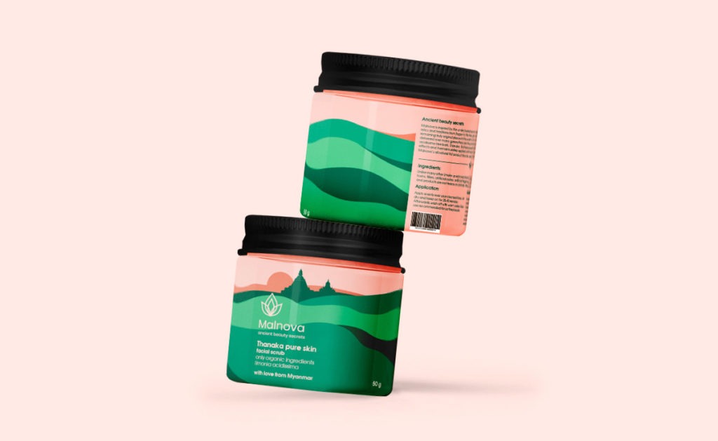
5. Fluid & liquid effect
This next graphic design trend affords a certain degree of freedom. Liquids come in various states, from thick and goopy to thin and free-flowing. Using fluid/liquid design elements, you can have a variety of effects that run the gamut of design inspired emotions.
Hoping to create an ethereal effect? Try using water-like textures. Want something a bit more industrial? An oil-like texture might be what you’re looking for. Fluid/Liquid effects work best when utilized in web design, especially when combined with open compositions.
Here are two great examples of using liquid effects:
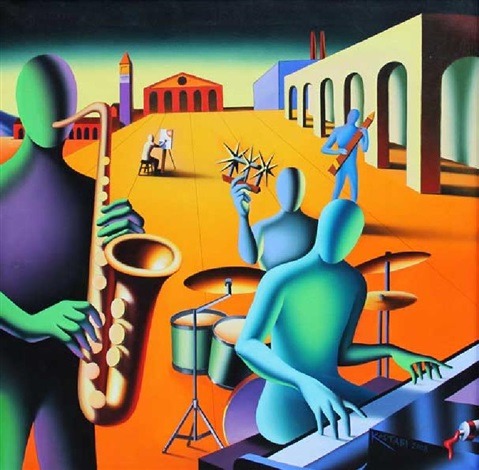
6. Alternative Art
There is nothing wrong with a well thought out classical composition that features clean lines, a proper balance of color, and a professional finish. But the problem with products and advertisements featuring “professional” looking artwork is that it is normal, and when it comes to graphic design, normal just won’t cut it. Instead of using traditional illustrations, try using some alternative art.
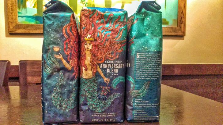
This graphic design trend has actually been around for a while, but it is making a comeback in 2019. Alternative art has a more improvisational feel to it than traditional forms of illustrations. More often than naught, alternative art takes the form of freestyle illustrations or hand-drawn doodles that, while aesthetically pleasing, are not quite as polished as other forms of art.
One company that has been utilizing alternative art for many years is the coffee-chain Starbucks. If you ever go into one of their stores at various times throughout the year, you will most likely see brilliantly designed bags of coffee featuring artwork that is both professional yet simultaneously around the edges. Take a look at this design from around 2015:
Tips for Implementing 2019 Graphic Design Trends
When it comes to implementing the latest trends into your cannabis design, keep an open mind. While you may prefer one design element over another, that doesn’t mean that you should stick to just one. Try using different elements to compliment one another. Open compositions work great with liquid textures and effect. Metallic elements look great when you incorporate vivid colors. And you can’t go wrong by throwing some anti-gravity effects into the mix.
Regardless of which graphic design trend you end up going with, what matters most is that you pick a design element that fits with your branding.