In the case of marketing, familiarity doesn’t necessarily breed contempt. It often breeds sales. Customers like consistency in their products’ branding. They expect to see the same label on the box, the same promise of quality in the ingredients, and the same logo. A company may update their font now and again. But short of an overhaul in mission followed by a rebrand, consumers respond well to consistency. A brand style guide helps a company maintain that consistency in all their consumer-facing work. That includes website copy, product packaging, or the sign at your brick and mortar shop.
Companies need a style guide so they have a resource to consult when making decisions around design and marketing. This rule book is your brand Bible. It dictates the structure, organization, and presentation of a company’s brand.
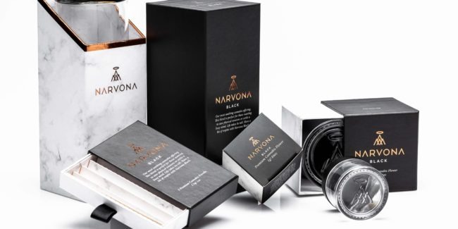
A brand style guide is an important tool for creating visual assets that deliver the values, goals, and promises of a company to its customers. A brand style guide is complete when it includes the following components.
Five Components All Brand Style Guides Should Include
1. About Your Brand
The style guide should open with a paragraph or a page presenting the mission statement and company vision. By placing these at the start, the company establishes the guiding principles for every design decision to be made. This ensures everyone involved in the design process creates a brand that helps the company reach its goals. If you want to include a brand persona in the style guide to summarize your target audience, include it in this section.
2. The Logo Design
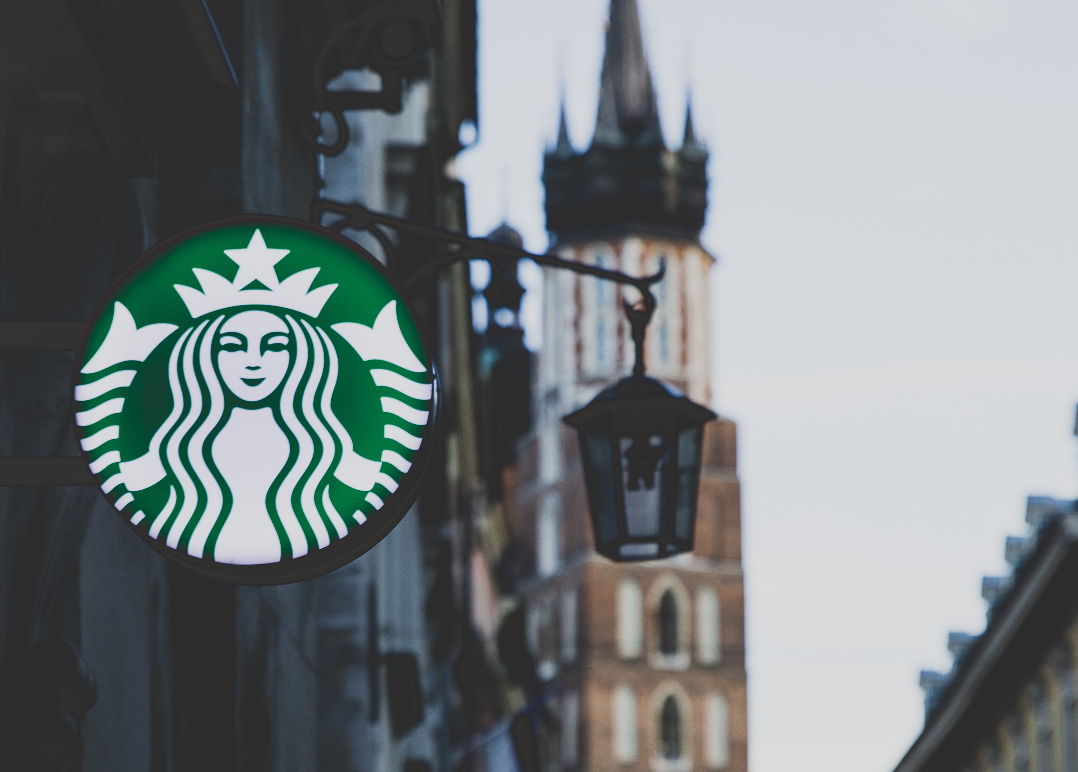
The logo is the cornerstone that sums up your company in one visual punch. Is your company one distinct symbol? Is it simply the name in a bold font choice? It’s the first thing many people will see about a company, often before they see the product (you see the Starbucks mermaid on the window before you go inside and see the coffee). The logo is the opportunity to make a good first impression and distill your company down to its very essence.
3. Typography
Sans serif versus serif. A font that looks futuristic or one that looks classic. Simple or cursive? The typography a company chooses has implications in how potential customers perceive them. If you don’t believe me, ask yourself whether you’d buy from a company who use Comic Sans for the logo.
4. Color Palette
Color evokes feelings. We attach emotions to colors, whether they are sunny happy yellow feelings, sad reflective blue feelings, or hot passionate red feelings. The wrong color system can confuse customers and leave them unclear of what signals you’re sending. Maintaining consistent color choices keep the company visuals unified across all messaging.
5. Editorial Guidelines
A company can have the most well-designed logo, perfectly chosen typography, and exciting, complementary color palette, and still lose customers if an errant grammar mistake or misspelling occurs. Editorial guidelines establish the written communication rules to follow. If a company makes a careless mistake and misspells a word on their homepage, a potential customer will wonder what other mistakes are being overlooked. Even if it’s a simple decision of whether or not to use AP Style, establishing it once in the guideline means no future designer or copywriter is left to wonder what’s correct. If there’s not an easy resource to find the answer, they will make their own decision and it might be different from the last person to work on communications. Again, it keeps the company’s messaging consistent.
A customer desires brand consistency for the same reason that folks don’t want to eat at a restaurant that’s constantly changing owners. We feel an aversion when we read the sign “Under new management” because it implies that something went wrong and needed to be changed, and now the restaurant is asking customers to go out on a limb and see if they got it right this time. We are creatures of habit who want our go-to restaurant for date night and our same products–whether it’s coffee, body lotion, or cannabis–that we trust and count on, consistently.